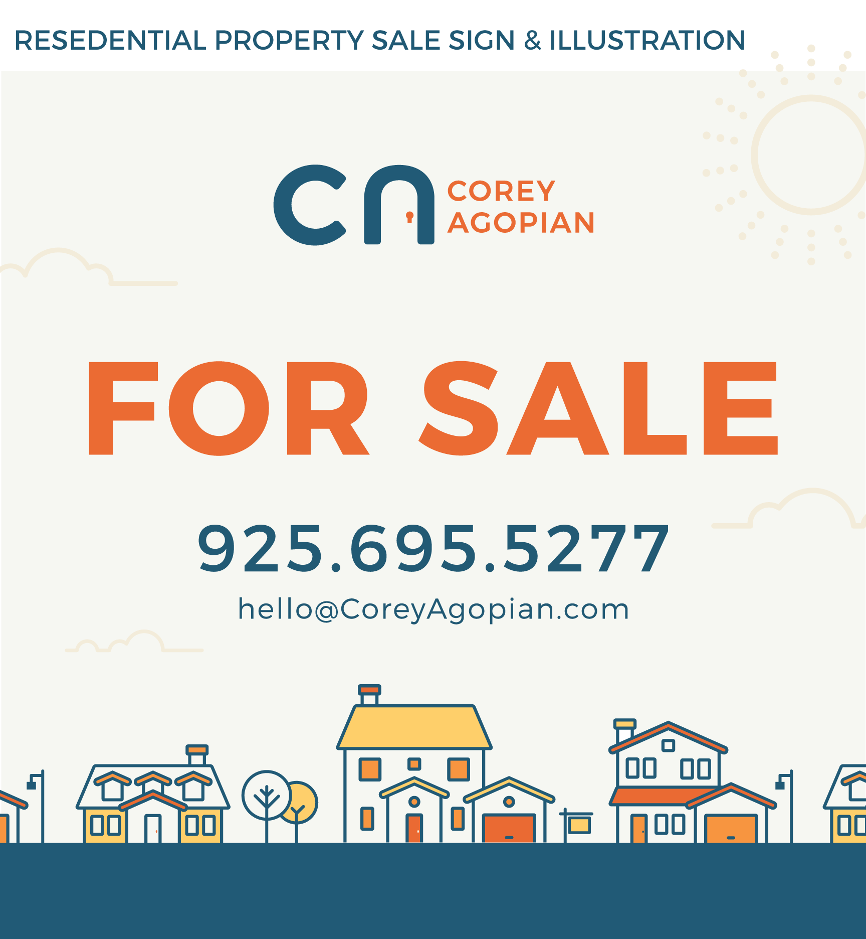
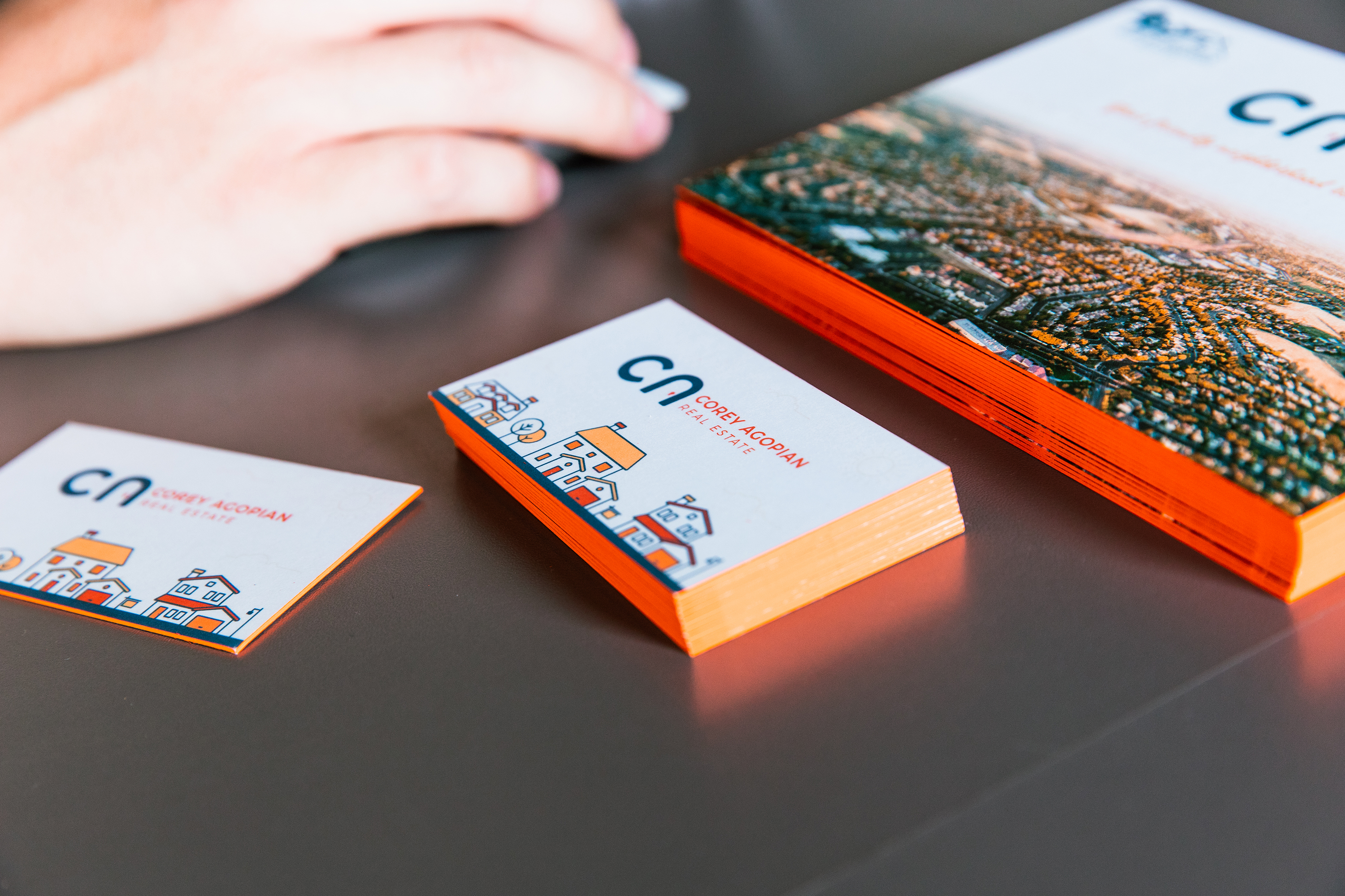
Corey Agopian is a young Realtor who understands the importance of design and branding when it comes to standing out in the crowded field of real estate agents. Corey was interested in creating a brand that he could begin to use and build that he intended to eventually expand into a brokerage.
My challenge was to design something that would differentiate Corey from the other agents, and also convey his personality in a way that would breed trust. Corey from the other agents, and also convey his personality in a way that would breed trust.
Because of the rules and laws associated with new real estate agents in California, we went through many iterations of the name. Finally, we realized that at the early stage we'd need to stick with just using Corey's name, but could eventually use elements of the same logo if and when he decided to expand into a brokerage.
After presenting a few design ideas, Corey was drawn to the door in the negative space with a keyhole design that I presented inside of his initials. It was a simple concept that had a bit of an "ah ha" moment but was still clean, legible and recognizable. We ran with that and began to build out additional elements of the branding - including the fonts, colors and overall tone of the copy.